SAP
Scalable Component Library for Experience Centers and Showcases
A unified, Brand-compliant Figma component library engineered for high-impact showcases across SAP’s physical and virtual Experience Centers.
Role
Design System Specialist & UX Designer
Context
SAP Working Student Role (SIX Design & Piloting)
Timeline
03.2025 – 03.2026 (1 year)
Tools
Figma, SAP Brand Guidelines
Deliverables
Figma Library (40+ Components), Usage Guidelines, Best-Practice Documentation
Challenge

Problem
Existing component libraries contained fragmented UI elements built under the SAP Fiori design system rather than the strict SAP Brand Design System required for flagship Experience Center demos. Team members had to build the components themselves causing inconsistencies and slow handoff processes.
Objective
Audit, consolidate, and build a unified Figma library adhering strictly to Brand guidelines, ranging from charts to specialized AI (Joule) components, backed by clear usage guidelines.
Research

Applied Methods
Component Audit • Design System Benchmarking • Stakeholder Interviews • Brand Alignment Analysis
Insights
Fiori Component Gaps & Brand Mismatch
Standard Fiori product design libraries lacked many essential components needed for immersive showcases. Additionally, existing Fiori elements didn't meet the strict SAP Brand Design requirements needed for high-profile events and retail environments like the S.Market.
Showcase Agility & Rapid Iteration
Event demos and Experience Center showcases require fast layout adjustments. Without a unified, pre-built library, designers spent redundant time re-creating complex UI patterns from scratch for every new showcase scenario.
Guidance for Complex Functionality
High-level components (like data visualization charts, interactive headers, and AI flows) came with intricate logic and variants. Clear usage documentation was essential to ensure team members could leverage their full functionality correctly without introducing visual or structural errors.
Design Process

UX Decisions
Systematic Audit & Feature Unification
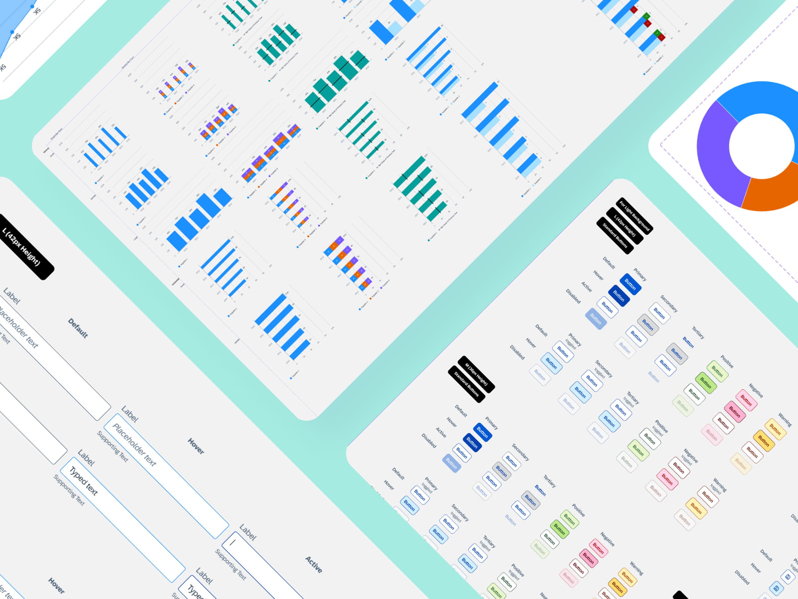
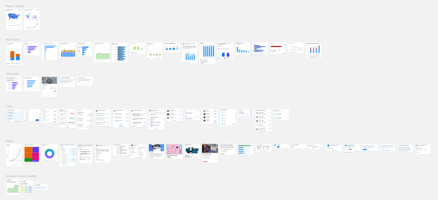
Researched all legacy showcase components, cataloged variations, and merged overlapping patterns into single, highly configurable components using Figma Properties (Variants, Boolean, Instance Swaps).
Brand-Compliant Foundations
Rebuilt core UI elements from the ground up, including headers, charts, input fields, and Joule AI Cards, ensuring 100% adherence to SAP Brand Design specs.
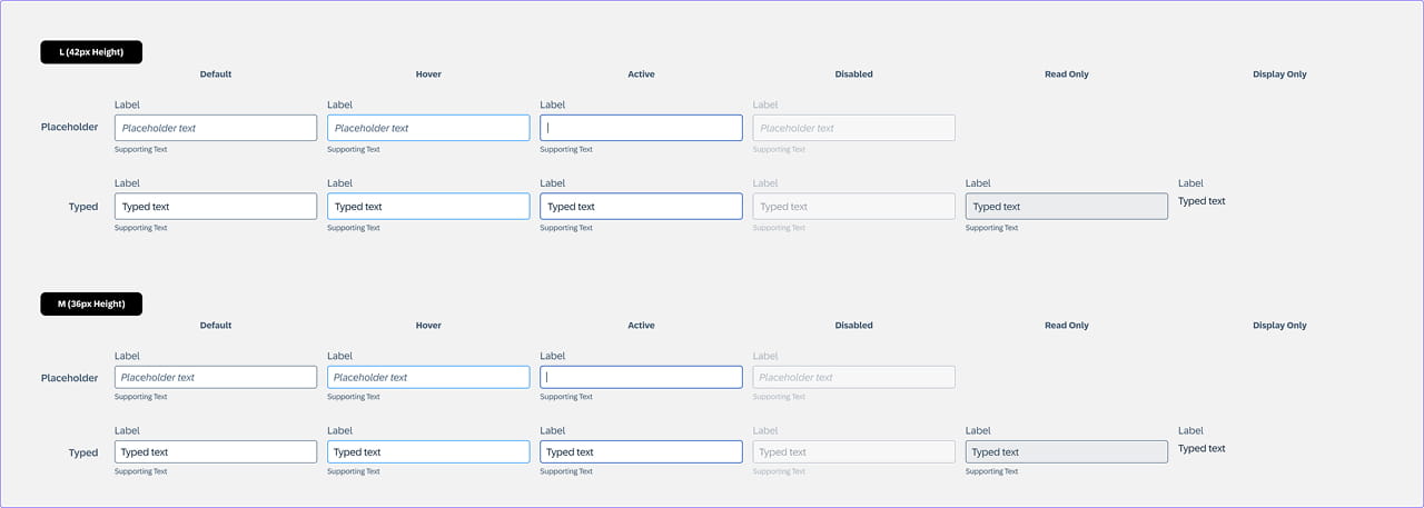
Tokenization & Auto-Layout
Engineered all 40+ components with flexible Auto-Layout rules, fluid resizing, and complex functionality.
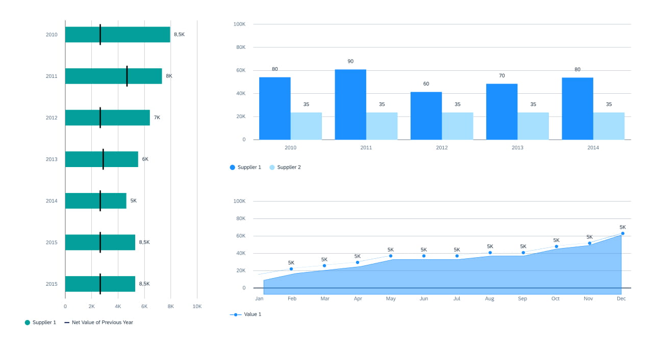
Handoff & Best-Practice Guidelines
Authored comprehensive usage guidelines and interactive component examples directly inside Figma to streamline onboarding for internal designers and external partners.
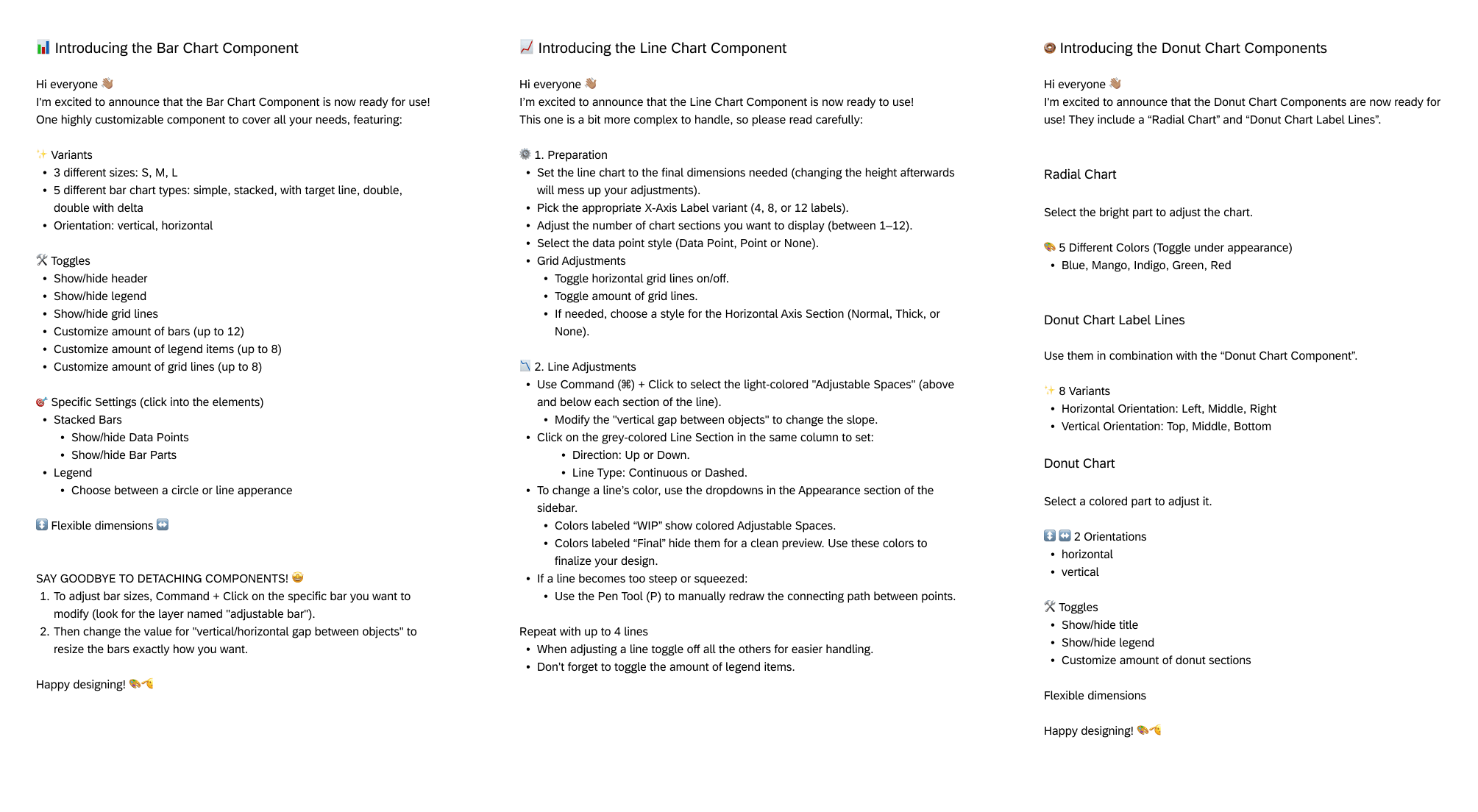
Solution

Key Features
High-Complexity Component Architecture
Engineered robust, production-ready components built with extensive Variant sets and Figma Component Properties (Boolean, Text, Instance Swaps). Designed to handle complex logic, responsive behavior, and dense data states (e.g., advanced charts or interactive headers).
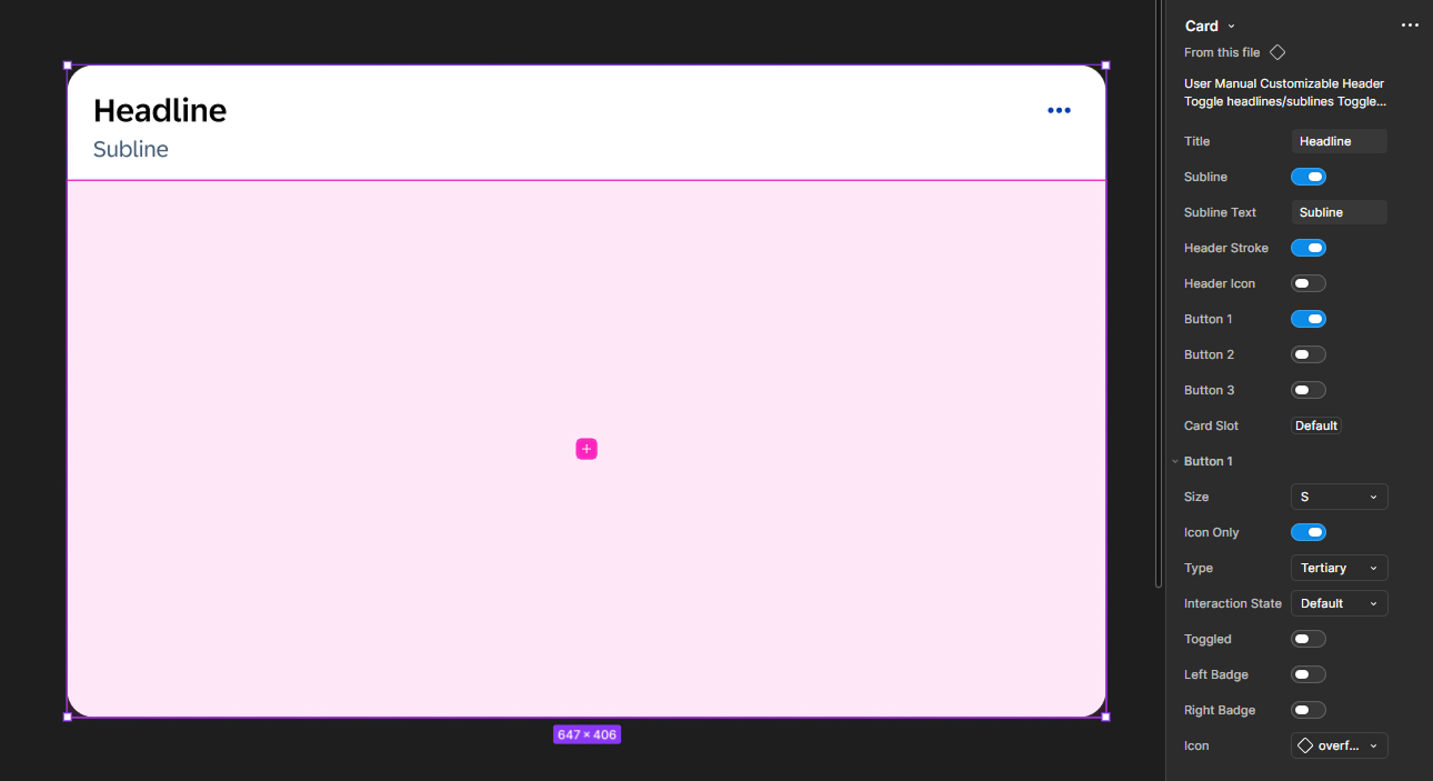
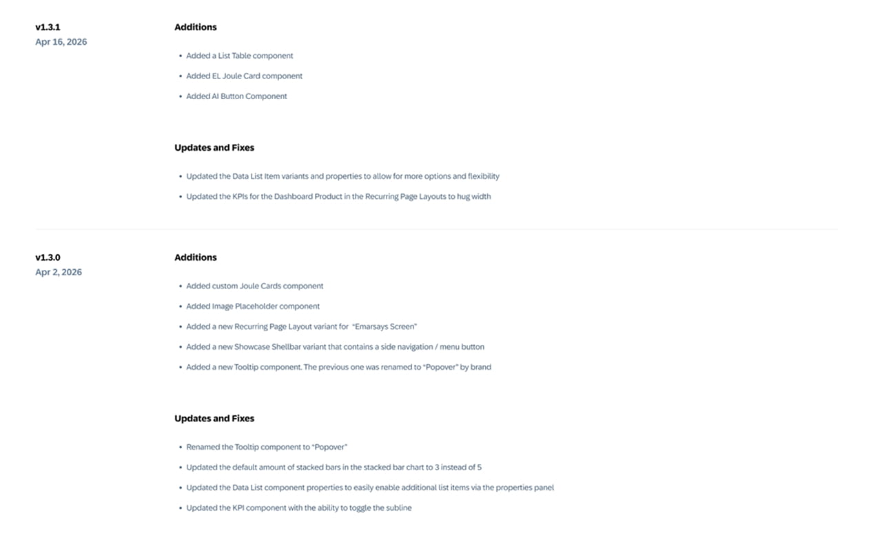
Iterative Release Lifecycle & Changelogs
Managed the library through a structured, multi-version release cycle. Implemented new feature requests, refined existing elements, and maintained detailed changelog documentation to keep cross-functional showcase teams aligned on updates.
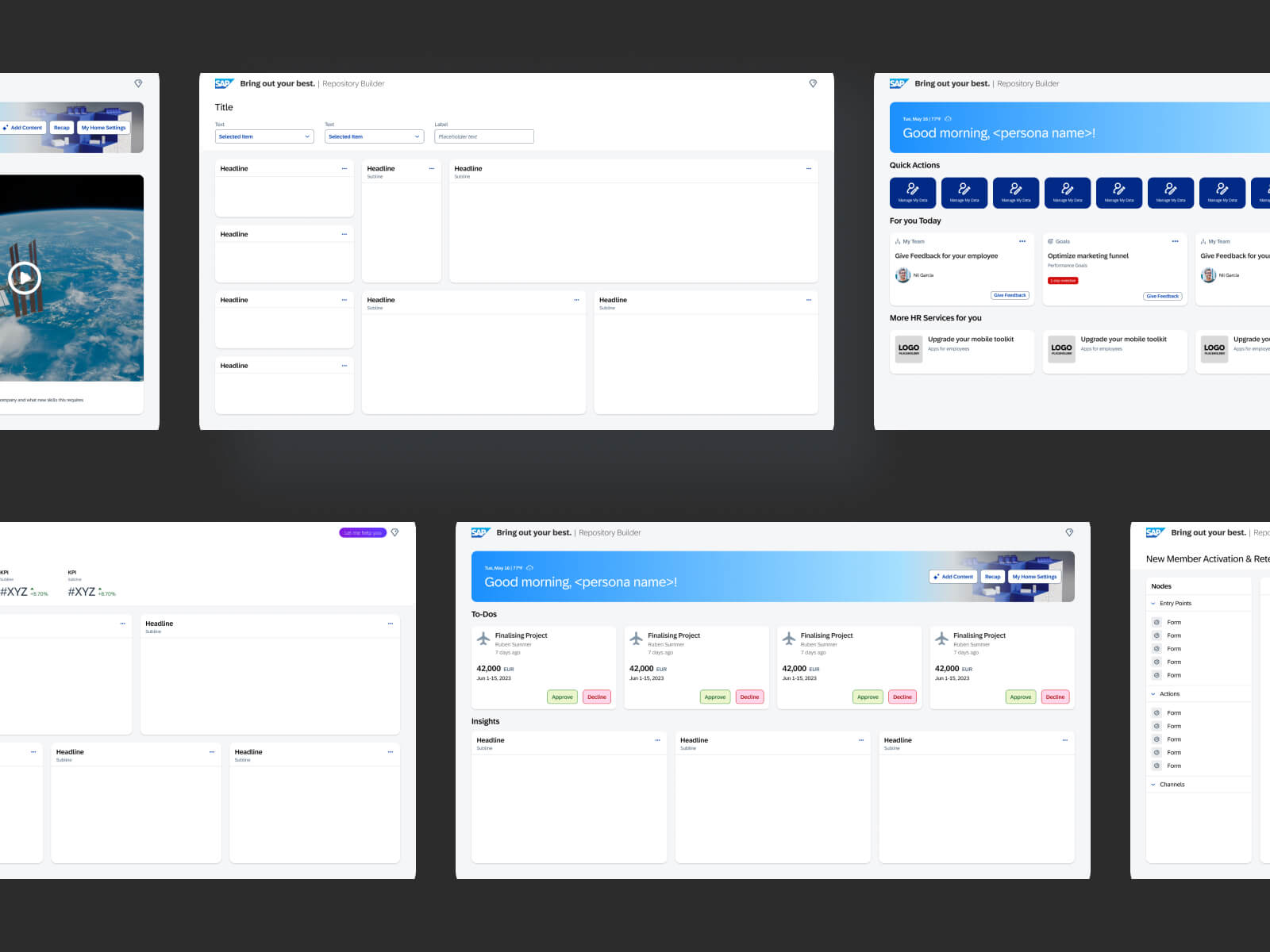
Dashboard Blueprints
Created a suite of recurring, full-page layout templates and dashboard wireframes. These pre-assembled blueprints allowed designers to rapidly build end-to-end showcase experiences and Experience Center demos without re-architecting page structures from scratch.
Retrospective

Outcome & Impact
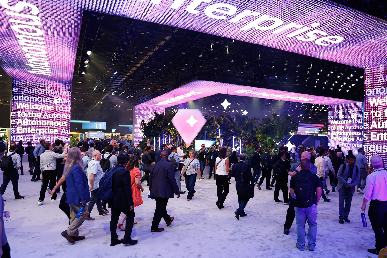
Successfully established SIXPAC as the go-to design system for the SIX Design & Piloting team, dramatically accelerating prototype turnarounds for major events like SAP Sapphire.
Personal Reflection
Working on SIXPAC reinforced how critical design governance and system architecture are at enterprise scale. Bridging the gap between strict Brand guidelines and functional UX requirements taught me how to build design systems that are both visually commanding and effortless for other designers to use.